Graphic Design
Visual identity
view a full page of only idenity design samples
Websites


Elli Crocker, Boston
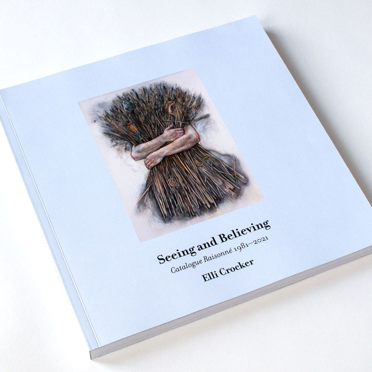
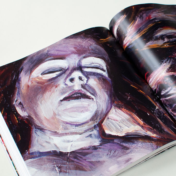
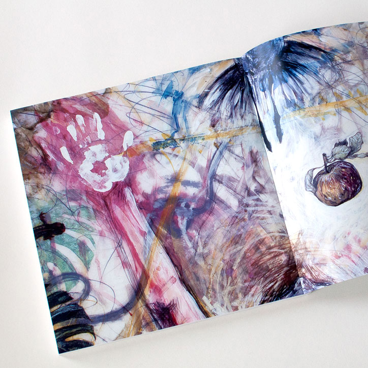
Seeing and Believing, Catalogue Raisonné 1981–2021
This three hundred page catalogue raisonné covers forty years of artwork by Elli Crocker during her tenure at Clark University.

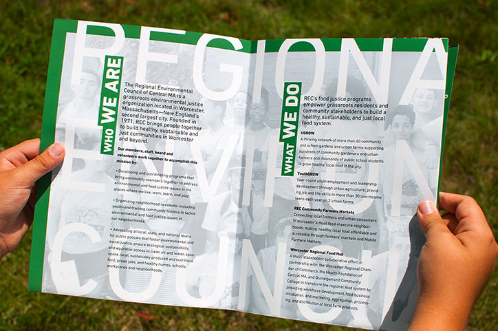


Regional Environmental Council, Worcester
Visual Nourishment: Cultivating Greater Engagement in Worcester’s Environmental Community
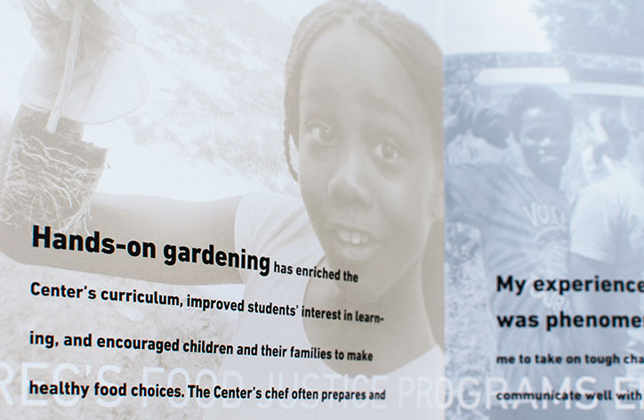
The Regional Environmental Council (REC) is a grassroots organization that brings the Worcester Main South community together to work on issues of environmental, food, and social justice in the city. Since the 1970s, they have been integral to the fabric of the city’s progress toward creating a more sustainable and just place to live.
Supported by a Sappi Papers “Ideas That Matter Grant”, I used graphic design to inform, engage, and to spread the spirit of environmental and food justice in the Worcester community. We worked to make the REC’s visual identity more cohesive and designed a small campaign consisting of vegetable labels, posters for farmers market stands, and a brochure. Our grant project was SAPPI’s People’s Voice Winner of 2015.

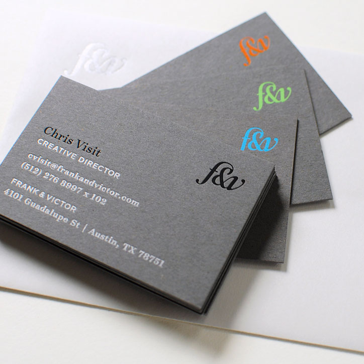

Frank and Victor, Austin
Logotype design for boutique graphic design studio. This logo was designed to communicate high quality print craft and to work well across diverse media and sizes.

Strong Side Brewing, Massachusetts
This craft brewery symbol was designed to expressed core values of strength, discovery, harmony, optimism, and empowerment.

Social Change Leadership Consulting, Melbourne
This logo for a social change consultant expresses ideas of change and challenging old ideas in civil ways.
bnourished, Providence
bnourished is an organization that helps people achieve positive change in their lives. They needed a logo that represented their core values and the overall mood they wanted for their visual identity; approachable, well-rounded, soft, caring, and compassionate. The logo is composed in a custom font that I designed.


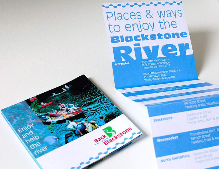
Back to the Blackstone, Worcester
I created this visual identity and outreach campaign in collaboration with a social marketing consultant for a group of nonprofit organizations dedicated to the restoration of the Blackstone River Valley watershed. The intention with this project was to attract parents and children to the recreational activities that are planned along the river and to thank those who partook.

Siena Art Institute, Italy
Card for font design course promotion. The black and white stripes reference the marble layers of the city’s iconic cathedral.

Math Altitude, Worcester
Logotype and social media icon for mathmatics school designed to suggest concepts of growth, while apprealing to both parents and youth. The image needed to be trustworthy, inviting, youthful, and give a sense of promise toward achievement.

Video assistant, Portland, Maine
Business card expressing the ideas of building and arrangement of lighting—two basic tasks of a video assistant.


Providence Youth Arts Collaborative, Providence
The Providence Youth Arts Collaborative (PYAC) is a collaborative of Providence non-profits who offer free after school arts programs to city youth. This work is the result of a year-long project where I researched the value of graphic design to create positive social change in Providence youth. Through collaboration with PYAC, my exploratory research resulted in a communication strategy, a visual identity, a city map of PYAC programs, a website, tote bags, and a video montage. Above are the two logo options, the color palette, and the map. There also a video montage. A book of my creative process and an essay on this project are available here.


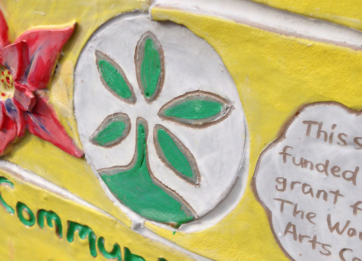
Regional Environmental Council, Worcester
The REC urban garden network is a treasure for Worcester’s Main South neighborhood. The gardens provide a place for youth to learn how to grow vegetables. The produce they grow is sold at local farmers markets. The REC needed a way to guide people to these gardens for self-directed walking tours. I designed the map and symbol used on the garden wayfinding signage. Artist Sarah Williams created the ceramic signs in collaboration with the youth who participate in the farming program.
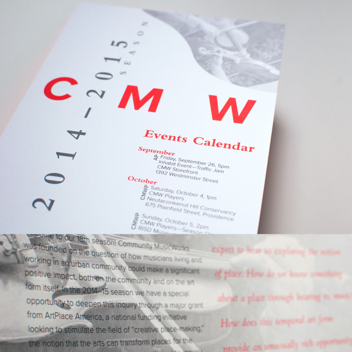


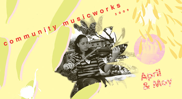
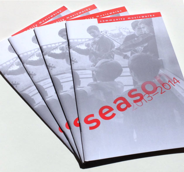

Community MusicWorks
Various printed matter intended to promote, express, continually refresh, and evolve the visual identity of Community MusicWorks; one of the top fifty after-school arts programs in the United States.

Icograda, Montréal
Pentagram created the core of this visual identity. I completed the standards manual, designed variations of the logo with Icograda’s tagline, and developed several identity signatures. Icograda has since changed their name to ico-D.
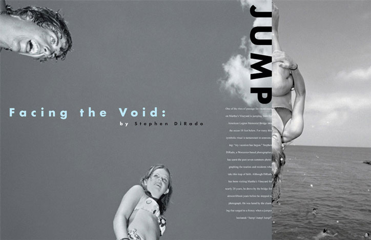
Blank Canvas Magazine, Worcester
Identity and publication design for an arts magazine; feature article for artist Stephen DiRado.
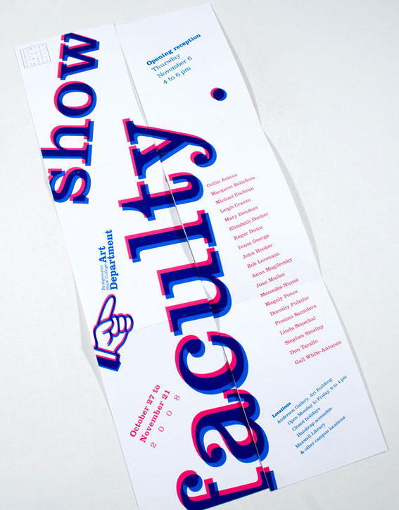
Faculty exhibition, Bridgewater State University
A postcard that unfolds to a poster to announce the annual art exhibtion.
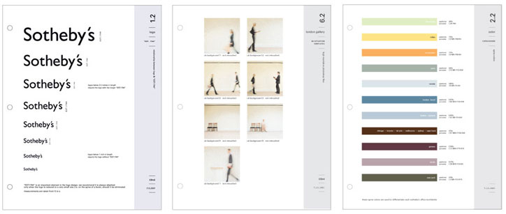
Sotheby’s, New York
I collaborated with Bouchez + Kent & Co. in New York to create this visual identity manual. Shown above is the logo size page, image templates and guidelines, and color palettes for their catalogs.
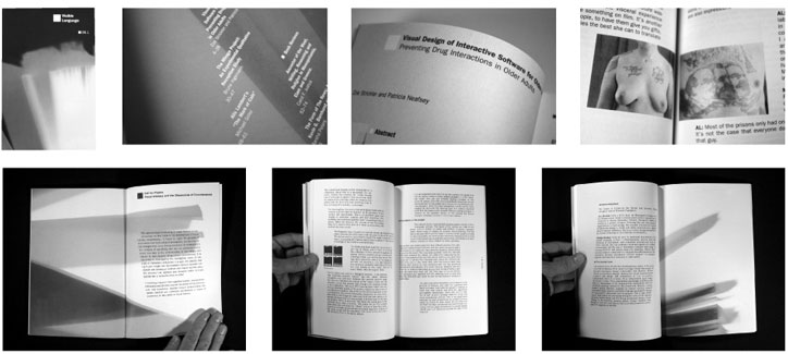
Visible Language, Providence
Visible Language is an international journal for visual communication. I designed this issue under the art direction of my former professor at the Rhode Island School of Design; Thomas Ockerse. The design concept was based on forms within photograms that I made from previous journals. I used the photograms for the cover, chapter separators, and inspiration for shaping the typography.
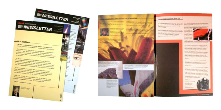
Kodak Nordic, Oslo
Newsletter redesign to accommodate five languages; Icelandic, English, Finnish, Norwegian, and Swedish.
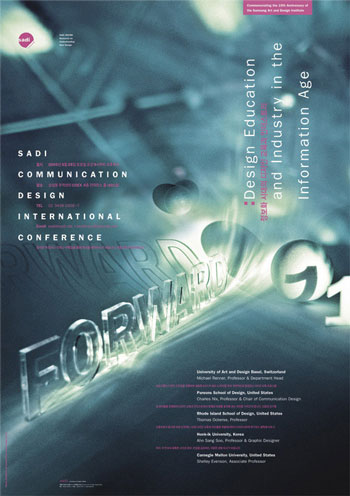
Samsung Art and Design Institute, Seoul
I created this poster and event logo for SADI to promote a conference on the future of design education. The staged photographic imagery represents the multiple points of view of the presenters, the optimism of the event’s theme, and the ephemeral nature of design. I made the photographic environment by hand with cut paper, styrofoam balls, laser-cut letters, and illuminated it with various sources. The circular part of logo is intended to represent the school or a table and the word “round” is an acronym for “research on understanding new design”, which represents new ideas coming to the table.
Phil Fox Photography, Massachusetts
Logo for wedding photographer. The client needed a logo that had both a modern and traditional appeal, which is reflected in the use of diverse fonts
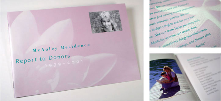
MacAuley Residence, Portland, Maine
Annual report for a transitional housing program for women and children. Images of regenerative and restorative moments and objects reinforce the meaning of this residence as a place for women to recover from addiction and break cycles of unhealthy dependencies.
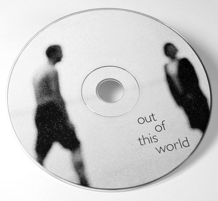
Moha, Oslo
CD package design and photography for rock duo—expressing concepts of love’s tensions, pleasures, and sublime moments.
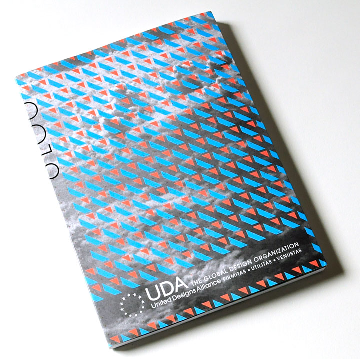


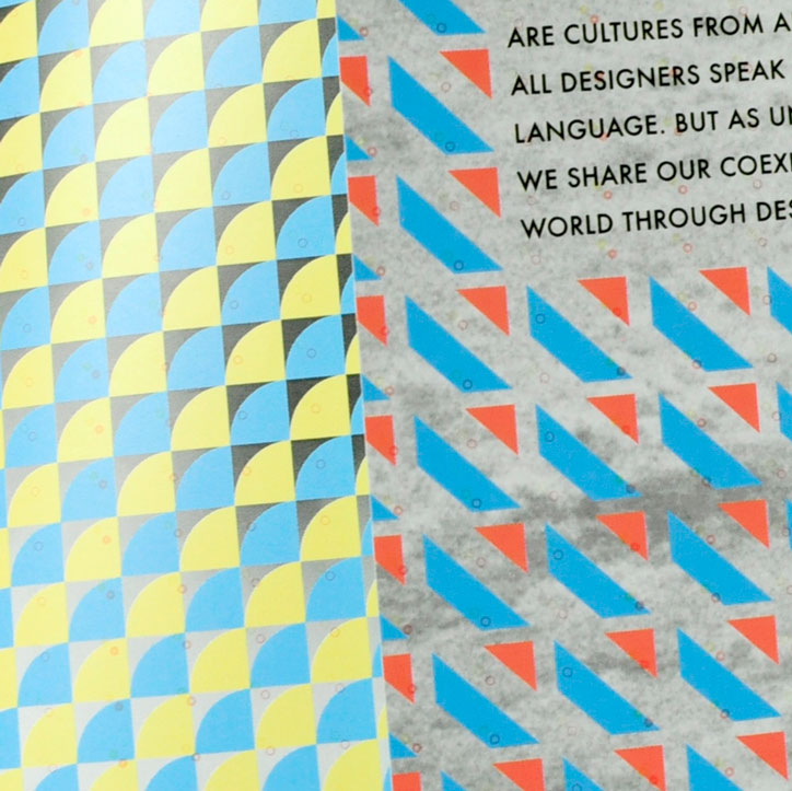
United Designs Alliance Exhibition Catalog, South Korea
United Designs Alliance invited me to design their 2019 exhibition catalog. I chose to use my typeface FormPattern Color Two to create a rhythmic surface where many small parts make up a harmonious whole, thus reflecting ideas of unity that the exhibition sought to promote. The image underneath the patterns is of clouds taken from an airplane window reinforce the global scope of participants.
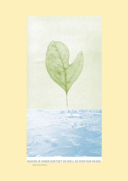
Environmental exhibition poster, Korea
This poster expresses concepts of nature and humanity, which where two primary themes of the exhibition. By placing a sassafras leaf, which resembles a human hand (albeit in a mitten) above the clouds I present the idea that nature is ulitmately above us and that we are inescapably one with it. This image montage is accompanied by a quote by Henry David Throeau, which connects the message to spiritual realms.
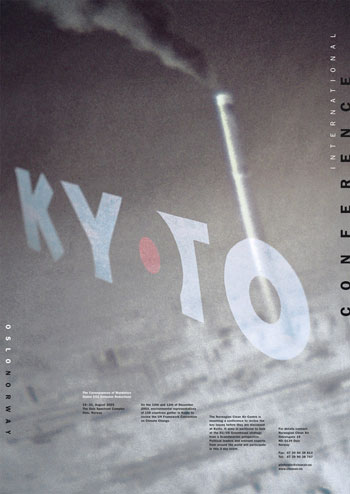
Kyoto Protocol
The Kyoto Protocol is an international agreement connected to the United Nations with the focus to address climate change and reduce greenhouse emissions. I designed this poster using staged photography. Set against an image of grey smog-filled skies, the blue Kyoto is intended to signify the cleaner skies that the Protocol hopes to achieve through its policies. The red dot visually connects the word “Kyoto” with the Japanese flag, since the agreement originated from this city. The missing letter “o” relies on the red dot in order to be visually defined. This simple visual puzzle elevates the viewer from reader to participant in construction of the message.

Hong Kong Design Institute/HKDI, Hong Kong
For this project the client asked me to create their visual identity from an existing logo. Above are sketches for the business card, color palette, a school catalog spread, and a family of sketchbooks. I derived the colors from my impressions of Hong Kong. These colors act as a system to represent the different departments at the school. The rounded corner references the rounded bowl-like shapes in the logo and their custom designed typeface.
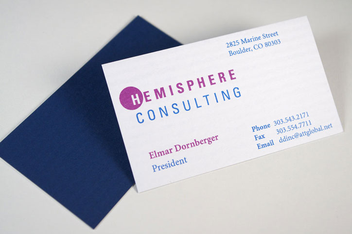
Hemisphere Consulting, Boulder
Visual identity and stationery set for a chaos management consulting company.
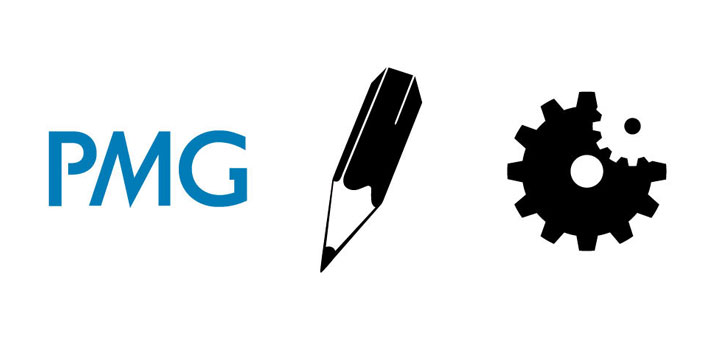
Presentations Media Group, Oslo
Logo and icons for web technology and design firm.
Bridgewater State University
Photographic illustration and cover design for academic conference.

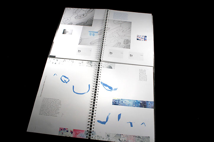
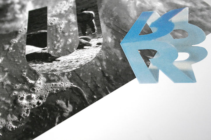
Rhode Island School of Design, MFA in Graphic Design
Thesis book on the relationship between typography & images, titled Together and in Love; Type and Image. Created under the mentorship of Thomas Ockerse and Franz Werner.
Thesis abstract:
My aspiration as a designer is to engage the graphic presence of words and images so that the dialogue between them generates a more multi-dimensional, in-the-moment encounter with the concepts behind them. Word and image do not have to exist in fields isolated from each other, yet they are often treated as such. As a mediator between content and visual representation, my interests are to unite these fields. In my design work, emphasis is given to reconsidering the conventional patterns of reading words and images within a prescribed space-time continuum. My efforts are to build hybrid compositions that capture a subject vividly. What is uncovered is a unity between the depth, space, and event “capture” of images and the conceptual dimension of words.
© Tarallo Design. All rights reserved.
All fonts, products, and website contents of Tarallo Design are protected by copyright, eulas, international intellectual property laws, and the Digital Millennium Copyright Act (DMCA).